PACKAGING | Products | Iconic
Building a brand from the ground up meant I that I needed to learn a lot in a short amount of time. The biggest problem though was that I didn't know what I didn't know. So I had to first identify the specific skills I'd need before developing them. Product development and product packaging were two such areas that required immediate attention–areas that now fell under the purview of Marketing.
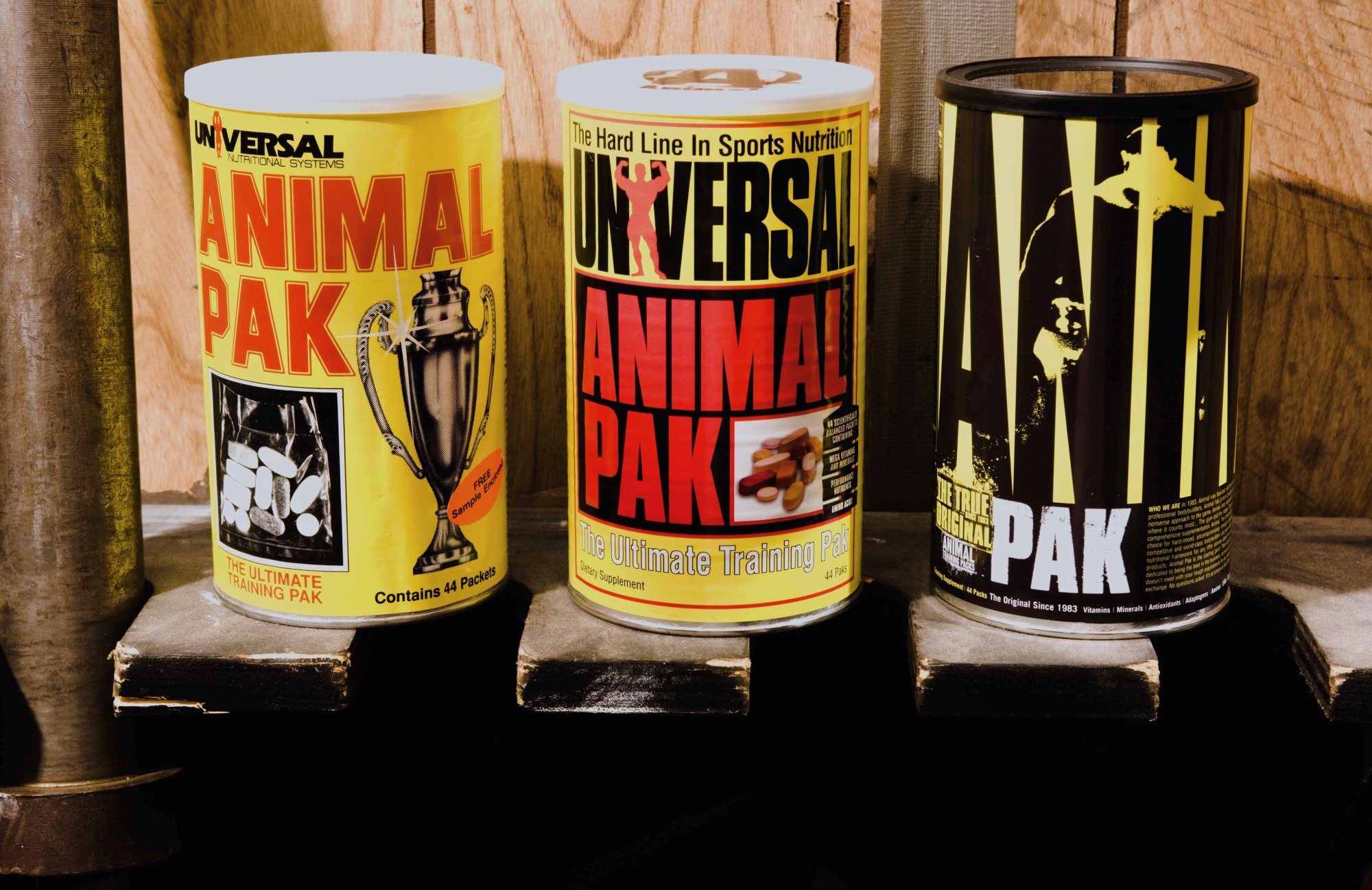
Three Decades of Animal Pak (1983-2022)

Though Animal Pak has been around since 1983, little changed over the decades. When the re-branding project started, I inherited the product above (middle). We used Animal Pak's 25th anniversary to introduce a look more consisent with the times, but also in alignment with the burgeoning brand. From the outset, I wanted a design that simultaneously looked backward as it did forward–classic yet contemporary.

Despite a corporate philosophy (all under one roof) that
discouraged seeking outside help, for this important project, we
interviewed several design firms in NYC and San Francisco among other.
We interviewed the best firms and within a few weeks, we were ready to
move forward with our top choice. Long story short, in the end, we
decided not use the designs submitted. This meant we had to go to a Plan
B and fast as we already lost too many weeks to get to this point.

While we considered other agencies, I worked directly with my "A" player, Henry. Rather than
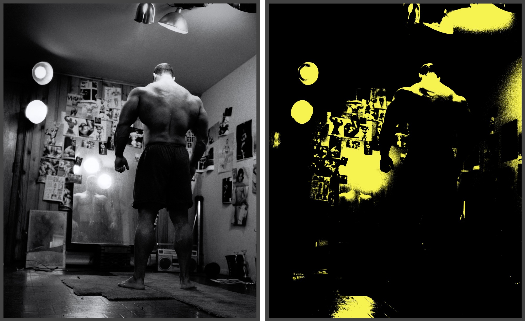
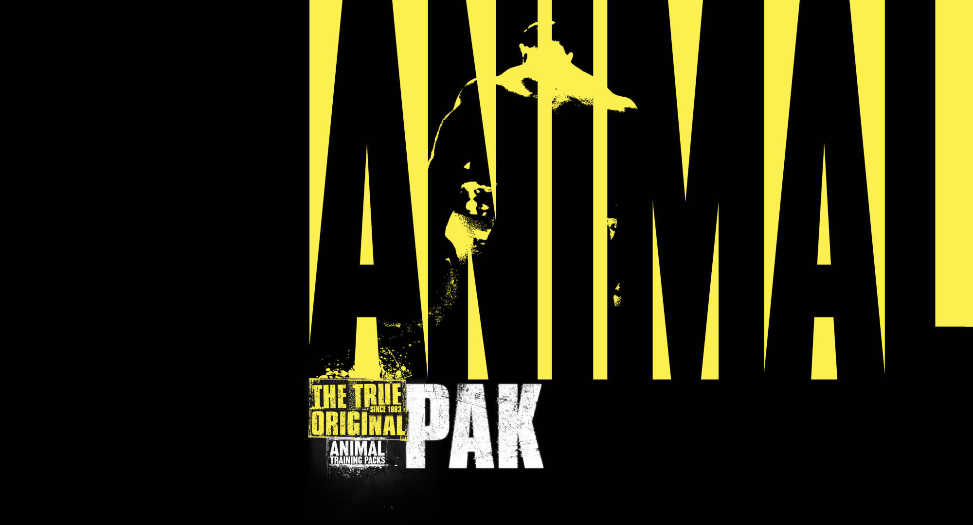
recreating the wheel, we ideated, relying on existing assets to speed up the process. In the end, the design template above is what we went with. To streamline the label design/print process in the future, the template was simple and modular–one that allowed for easy mixing-n-matching
(mostly the nutrition info and text depending on the product). All the products in Animal were in red, each featuring a different center icon, while Pak remained yellow as a nod to its heritage.

Animal Iconography
Internally, we referred to the label product as Animal "iconography." Understanding the power of naming, as with other key terms (e.g., brotherhood, journey), I saw this as an opportunity to add meaning and depth, not just to labels, but to the brand as a whole. The word "iconic" referred to the new Animal label design, but over time, we linked that term to other aspects of the brand.
Connecting the dots, we created an an campaign called Animal Iconic. We also took the visual image ("icon") that graced the center panel of the products, and later created branded t-shirts that eventually became synonymous with Animal. That new style embraced by thousands of fans. This ultimately lead to the development of Animal Gear, the apparel wing of the brand (that's a story for another day). One year, we even held a special "Sea of Yellow" event in The Cage shortly after the launch of the new labels–many hundreds of fans showed up at the appointed time wearing tthe standard-issue yellow Iconic Tee.