Breach
After several years of print that focused on honest, gritty, and intense B/W imagery, I thought it might be time for a change. Sometimes, that impulse to change is one of the worst feelings you can have when you are managing a brand. I'd also need to consider the fact that at this point in Animal's history, it was no longer about establishing a beachhead in the minds of consumers, but rather, how to continue making progress inland.
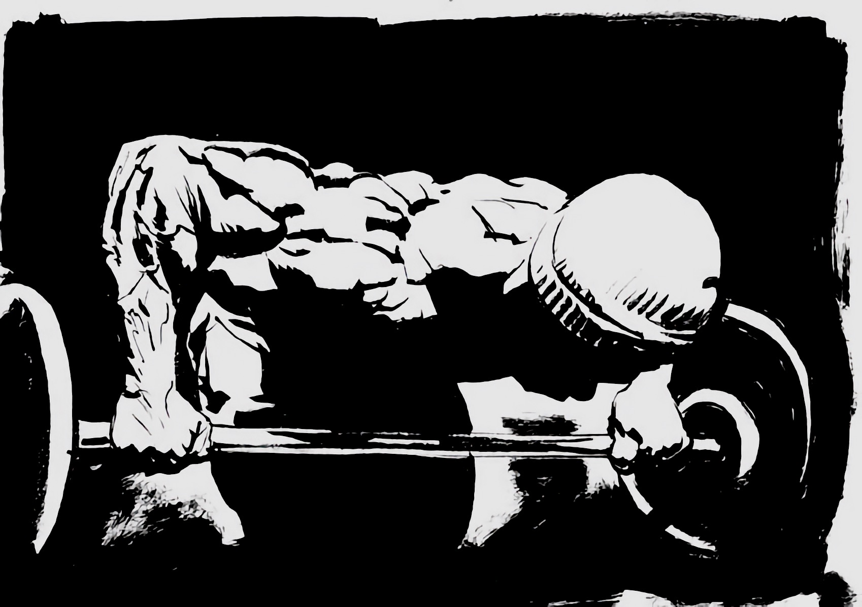
Growing
up, like many boys, I was a big fan of comic books. Every quarter I
saved, I put away for as many comics I could buy at the end of the week.
I can still remember the smell, when you cracked it open and put the
book to your nose. I didn't necessarily succumb to the amazing powers or
incredibly sculpted physiques of Thor or the Incredible Hulk. Instead,
each comic book I read opened up a new world to me–one that was very
different than the one I was living in at the time. The other
interesting thing I remember is that I was always drawn to teams more
than individuals. I loved the Avengers, X-Men, Defenders, and Fantastic
Four (I just wish they could make a competent movie for once).
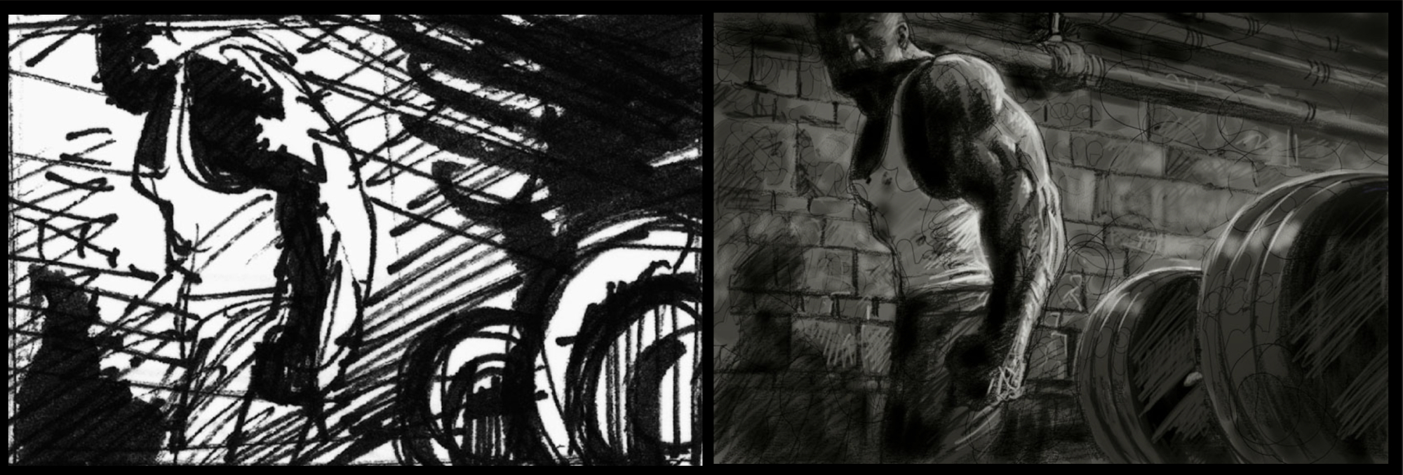
Instead of early Marvel, I imagined something grown-up, more realistic and perhaps darker–something you'd find in graphic novels. As a fan of graphic novels, I knew my way around the community. It didn't take me long to come across the work of an Eisner-award winning artist named Sean Phillips who lived and worked in the U.K. I pitched my ad concept and he agreed to work with me. Though I had worked on all kinds of different writing projects (from a PhD dissertation to poetry, technical bulletins to grant proposals), I never imagined I'd get a chance to work on a project like this–it was like a dream come true.
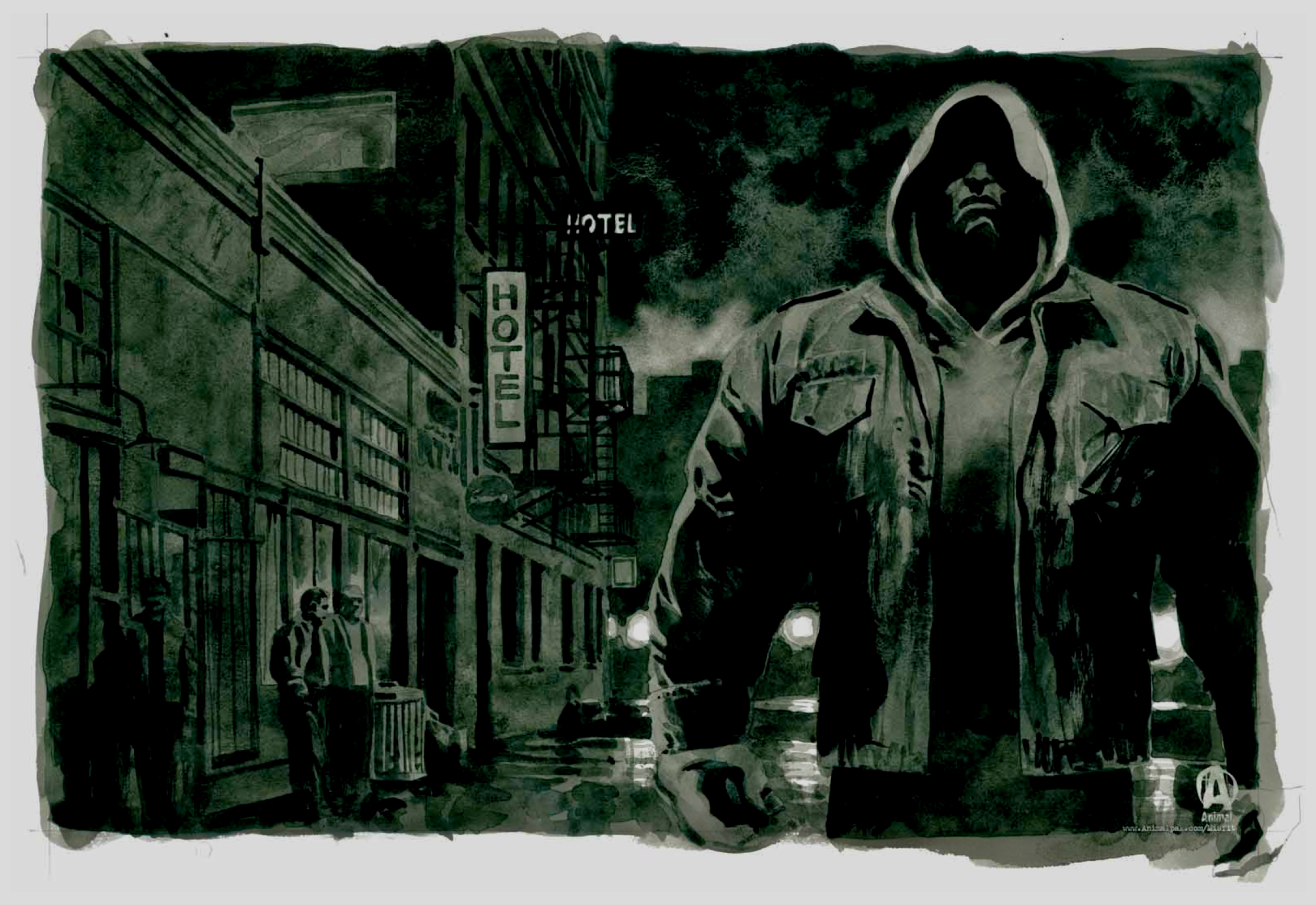
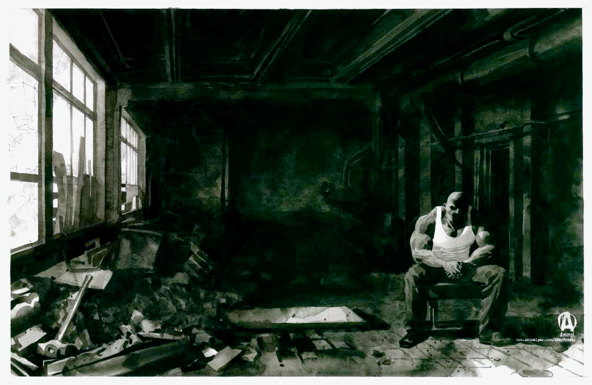
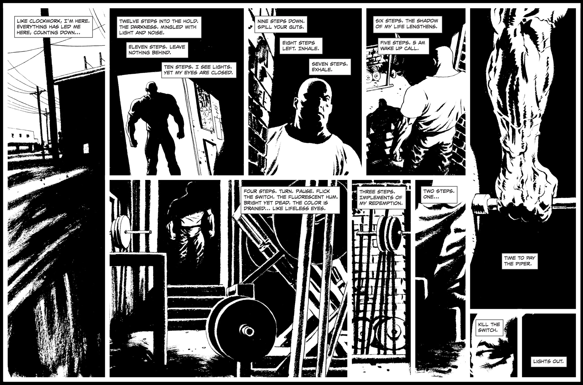
Like the Journey campaign before it, this one was character driven–it explored the mindset and inner workings of an Animal. Breach was also featured in print and online. The original images painted in water colors were featured in print (M&F, Flex, etc.), while the B/W panels ran online. We built a special microsite with the hopes of generating more online traffic. I was more than happy with the work Sean was doing–his artwork captured a grittiness that I thought worked well with Animal. But his water color paintings were even more impressive.
"Rise Up"
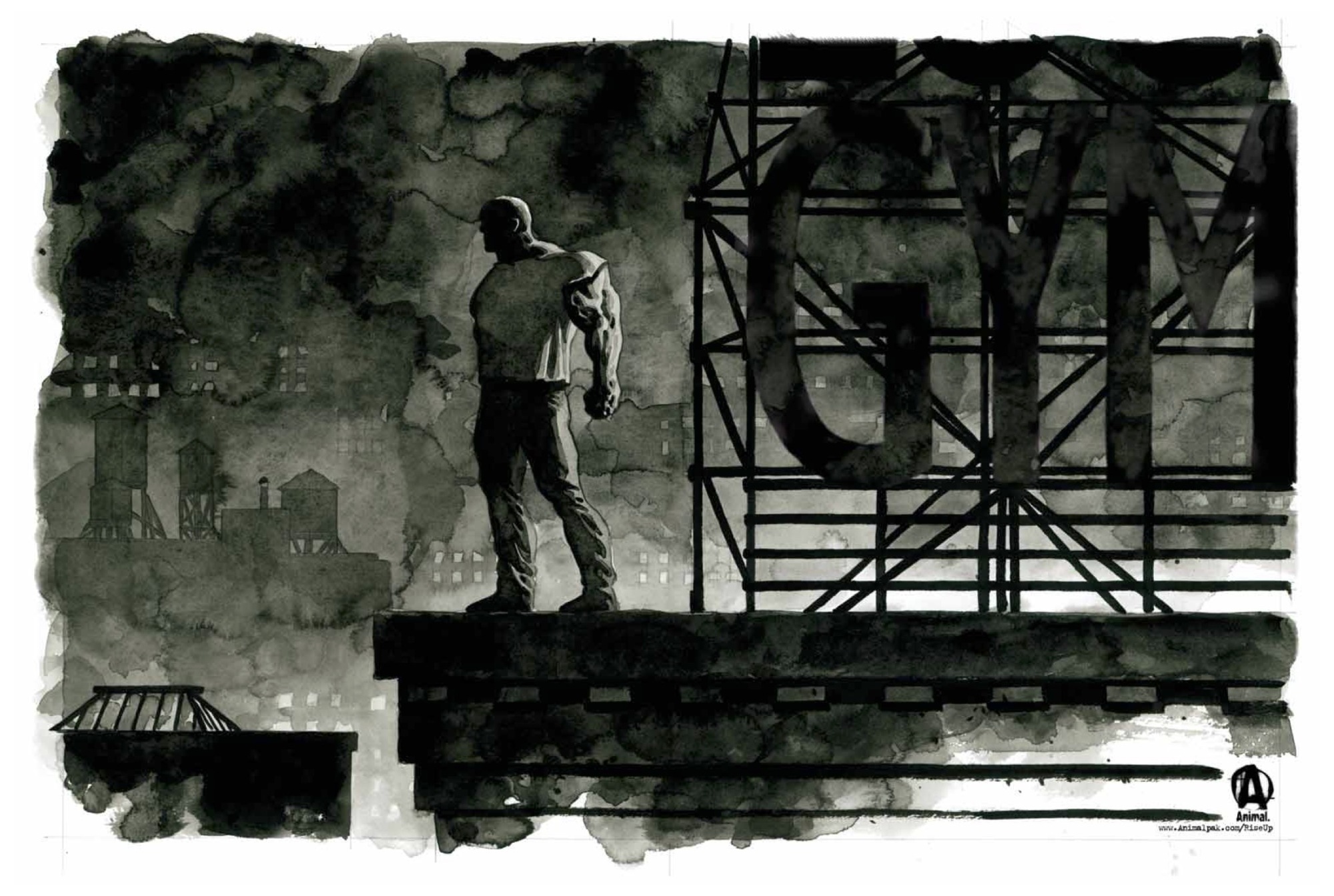
The paintings like the one above and below were run as spreads in
print. Incidentally, as part of our arrangement, Sean promised to send
one of the original paintings to me. When I received the original from
him, I had the art framed to museum quality specs. As I write this, I
can see it hanging on my wall. The paintings like the one above and
below were run as spreads in print. Incidentally, as part of our
arrangement, Sean agreed to send
one of his original paintings to me–I chose "Rise Up" (see below). When I
received the artwork, I had it framed to museum quality specs. As I
write this, I
can see it hanging on my wall.
• • •
PRODUCT ADVERTISEMENT | Animal PM
As part of our main creative print campaign, we also deployed product ads as well. To maintain brand consistency in general as well as campaign consistency in particular, the product ads looked like seamless extension of the lifestyle brand ads. Here is example of our product ad for our sleep support product, Animal PM.
• • •
More | When I started, we sold a product called Animal Pak. But over time, we
grew a lifestyle brand around Pak. One way I knew we were on the right track had
to do with the feedback we were getting about our ads and articles on
the website. Instead of a product like a pre-workout, our fans would
read an article before heading out to the gym. We had products, but we
were selling something bigger. On a side note, I saw a problem developing. On one hand, our ads highlighted the solitary individual who lived on the periphery, marginalized but not impotent. Rather than being seen as "every man," Wrath or Machine came alive and their personas grew larger-than-life. On the other hand, we were trying to build a tangible community ("Brotherhood") of like-minded, equal individuals. In short, how did you remove sponsored athletes from their pedestals despite a growing "cult of celebrity"? How would you balance "communitas" with an individual's will-to-power, his "self-overcoming"? Managing this dichotomy was a tricky thing. But as always, if you are perceptive to the world around you, you can find answers where you least expect it. In looking back, I realize the answer lay in comic books–the Mighty Thor was still mighty, still fundamentally himself, as part of the Defenders. Having a history with superheroes provided me with another insight as well. Talking to our users, whether on Customer Service calls, talking to fans at local ABC events, or chatting with thousands of fans at expos like The Cage, I saw a simple but meaningful pattern–many consumers I spoke with also read comics books–but instead of keying in on escapism, they idealized physiques and the muscles–the symbols of strength and power. Why not develop an ad campaign that might resonate in a new way and reach a different segment?
[ To Product Campaign: Animal Flex ]